New Qt blog retarded design
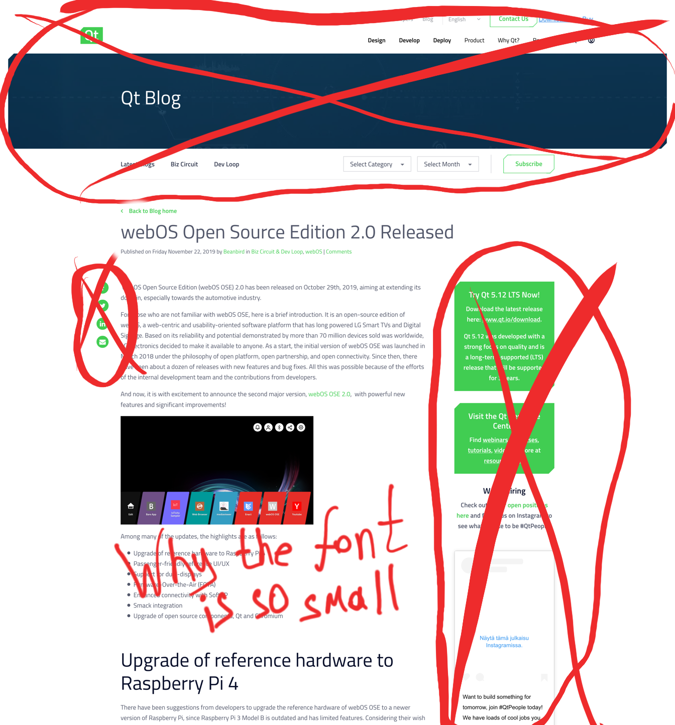
Geniuses from Qt marketing team have (again) changed the website design. The blog now looks especially retarded:

I couldn’t tolerate this, so I wrote a custom CSS for Stylus.
What’s wrong with the current design
Many things are wrong with the current design:
- gigantic top block
- tiny font size for the actual post content
- way too big top margins for headers elements
- absolutely unnecessary paragraphs containing nothing but whitespaces
- annoying sliding social media buttons on the left
- distracting widgets on the right, taking space that could have been used for the actual content
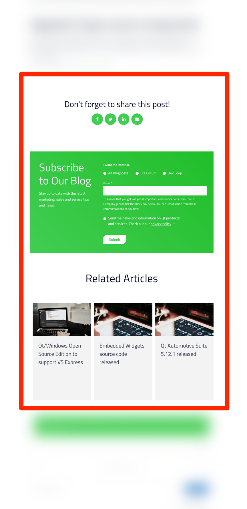
- bitch-ass-long appendix with enormous subscribe form and once again fucking social media buttons
Of all things it’s the appendix that I hate the most. I mean, just look at the size of this shit:

What the hell, in some posts this block is twice as big as the actual post content. Pure genius.
How to make it better
Here’s a CSS you can use with Stylus to make the Qt blog to look a bit cleaner:
body {
    padding-top: 0;
    margin-top: 0;
}

.b-blog-post__content h2 {
    margin: 30px 0 15px;
    font-size: 200%;
}

p, ul {
    font-size: 20px;
}

.b-blog-post-header__container.b-blog-post-header__container--narrow {
    padding-top: 1em;
    padding-bottom: 2em;
}

.row-fluid-wrapper.row-depth-1.row-number-1,
.row-fluid-wrapper.row-depth-1.row-number-2,
.b-blog-post__share--sticky,
.c-floating-contact,
.span3.widget-span.widget-type-cell.b-blog-post__sidebar,
.row-fluid-wrapper.row-depth-1.row-number-7,
.b-blog-post__share,
.row-fluid-wrapper.row-depth-1.row-number-8,
div#hs_cos_wrapper_module_156525825582399
{
    display: none;
}

.span9.widget-span.widget-type-cell {
    width: 100%;
}
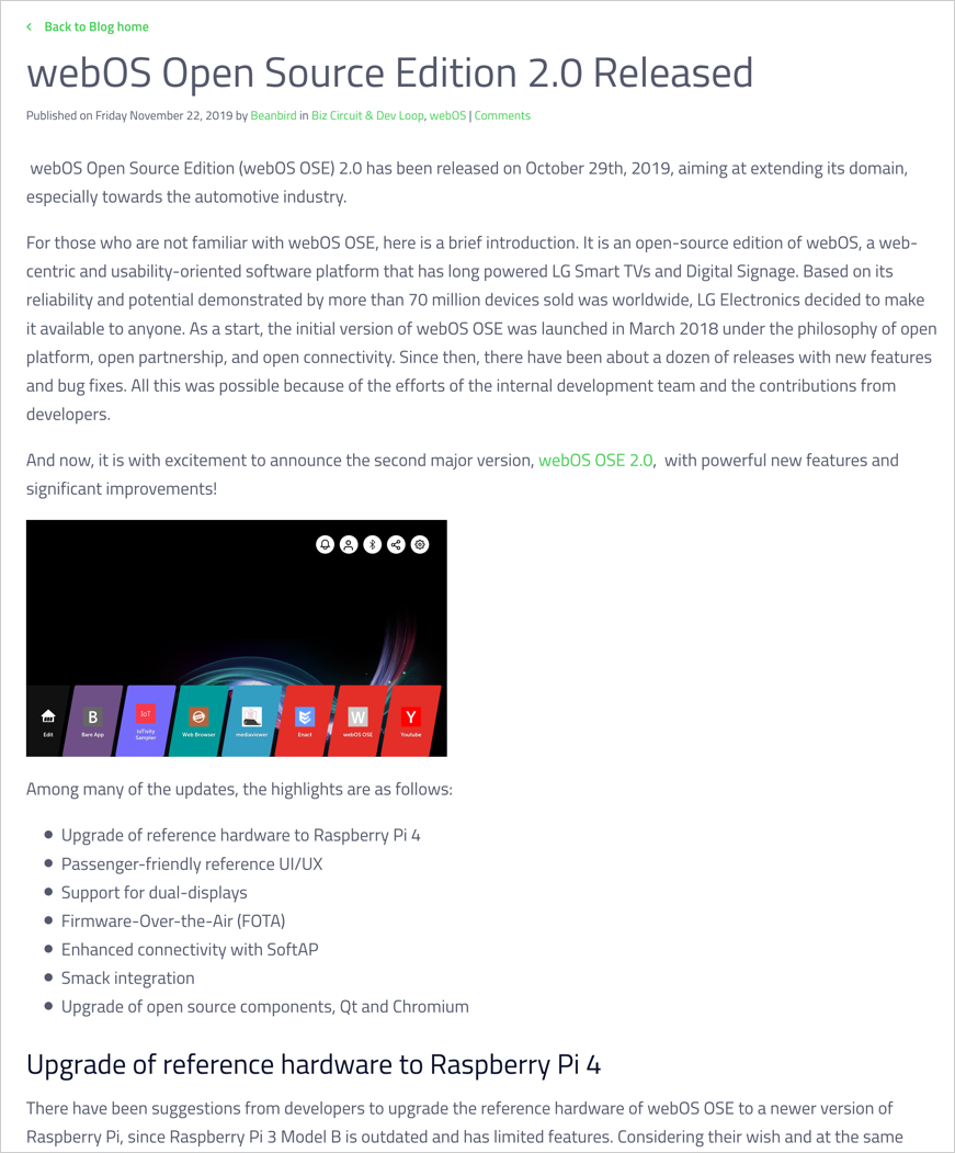
Here’s how the blog looks like with these styles applied:

Better, innit.
Oh, and don’t forget to enable uMatrix and uBlock extensions, because without those you’ll be loading all sorts of crap:
But that was always the case, new design has little to do with it.
I also liked how they moved from WordPress comments and started using Disqus comments for a bit, but then promptly switched to Commento. That’s some thorough preparation right here.
Well, till the next CMS migration then in a couple of months.


