Visitors analytics with Microsoft Graph
Our company uses Office 365 and Azure Active Directory, which allows us to rely on SAML SSO for authenticating company users on our websites. At some point we got curious about what kind of users visit our websites - not quantities but kind of “corporate demographics”: what is their team/department name, their role/job title, their manager, country where their office is and so on.
We don’t collect any of this data on our websites (we probably could, at least on those where we control the authentication process, but we don’t). The only piece of information that we do have about our visitors (aside from IP-addresses in web-servers access logs) is their e-mails and GUIDs, thanks to SAML SSO. That might not seem like much, but knowing just the e-mails (or GUIDs) is actually quite enough, as one can use Microsoft Graph to query more data using those. And for the actual analytics purposes that data can then be visualized/presented using Matplotlib charts.
Collecting e-mails
We have several internal websites and services that rely on Azure AD SAML SSO for authentication:
- an in-house-made CMS
- self-hosted GitLab instance
- self-hosted JFrog Artifactory instance
So the first task is to export users e-mails from each of those and merge them into one list.
In-house CMS
This one is the easiest, as it uses our own SQLite database, and all the users e-mails get be queried like this:
SELECT email FROM users;Or, if we want to exclude our team (roles 1 and 2):
SELECT DISTINCT(email) FROM users AS u
LEFT JOIN users_roles AS r ON r.user_id = u.id
WHERE r.role_id IS NULL OR r.role_id NOT IN (1, 2);
For convenience, that could be done in one line via SSH:
$ ssh cms.our-company.com "sqlite3 /data/cms.our-company.com/database.db 'SELECT DISTINCT(email) FROM users AS u LEFT JOIN users_roles AS r ON r.user_id = u.id WHERE r.role_id IS NULL OR r.role_id NOT IN (1, 2);'" > emails-cms.txtOf course, all that is unlikely to be directly applicable to your infrastructure, but it might be somewhat useful still, so I decided to mention this too.
GitLab
Users profiles can be fetched using GitLab’s REST API, for example:
$ curl "https://gitlab.our-company.com/api/v4/users?per_page=100&page=1" -H 'Authorization: Bearer ADMIN-TOKEN-HERE' -o ./users-gitlab.jsonResults are paginated, and one page can only have 100 items maximum, so you’ll have to execute as many requests as there are pages (&page=1, &page=2, etc). If you have too many pages, perhaps you’d want to automate the pages iteration too.
This endpoint returns the entire users profiles, not just e-mails, so you’ll need to write some script to extract just the e-mails, for example extract-emails-from-api-results.py:
import sys
import json
import pathlib
# common auxiliary module
import etc

argc = len(sys.argv)
if argc < 2 or argc > 2:
    raise SystemExit(
        " ".join((
            "[ERROR] Expected the path to JSON file (.json) with results",
            "from GitLab (and nothing else)"
        ))
    )

jsonFile = pathlib.Path(sys.argv[1])
if jsonFile.suffix != ".json":
    raise SystemExit("[ERROR] That doesn't look like a .json file")
if not jsonFile.is_file():
    raise SystemExit("[ERROR] There is no such file")

usersEmails = []
# cnt = 0
# cntWOus = 0
with open(jsonFile, "r") as f:
    gitlabUsers = json.load(f)
    for user in gitlabUsers:
        email = user["email"]
        # print(email)
        # cnt += 1
        if not etc.shouldIgnoreThatUser(email):
            # cntWOus += 1
            usersEmails.append(email)
# print(f"Total users: {cnt}, without our team: {cntWOus}")

# rename emails.txt to something else, for example emails-gitlab.txt,
# otherwise you might forget and accidentally overwrite it
with open("./emails.txt", "w") as f:
    f.write("\n".join(usersEmails))
The etc.py script contains some shared code that could be used by other scripts, such as blacklisting users from your team so they don’t add “noise” into visitors analytics:
yourCompanyUsers = [
    "witch.doctor@your-company.com",
    "phantom.assassin@your-company.com",
    "bounty.hunter@your-company.com",
    # ...
]


def shouldIgnoreThatUser(email):
    email = email.lower()
    if (
        email in yourCompanyUsers
        or email.endswith("dota2.com")
        or email.endswith("valvesoftware.com")
    ):
        return True
    else:
        return False
And then you can extract the e-mails like this:
$ python /path/to/extract-emails-from-api-results.py ./users-gitlab.jsonAlternatively, one can likely extract users e-mails directly from the database (given that he has access to it).
JFrog Artifactory
The Artifactory also has a REST API, and here’s how you can get users profiles:
$ curl -u admin:TOKEN-HERE https://artifactory.our-company.com/artifactory/api/security/users -o ./users-artifactory.jsonYou can use the same extract-emails-from-api-results.py script as with GitLab, just replace user["email"] with user["name"] and:
$ python /path/to/extract-emails-from-api-results.py ./users-artifactory.jsonSome usernames in the Artifactory might not be e-mails, for example if you are also using local Active Directory authentication for your team or manually created accounts for external users. In that case you’d need to get e-mails for each of such users from a different endpoint/method, which is tiresome. Luckily, we are not really interested in such users, as all the SAML SSO users do have e-mails as their usernames, so we can just filter out non-emails strings with ^[^@]*$ RegEx, either in a text editor or with sed:
$ sed -i "/^[^@]*$/d" /path/to/emails-artifactory.txtAnd again, instead of all that, one can probably just extract users e-mails directly from the database.
Merging e-mails lists
Now when we have 3 lists of e-mails from all the websites, we can copy-paste them, for example, into Sublime Text and execute Edit → Permute lines → Unique, to get a merged list of unique e-mails.
Alternatively, you can try to do this with standard CLI tools. First merge all of them into one:
$ sort -u ./emails-cms.txt ./emails-gitlab.txt ./emails-artifactory.txt > ./merged.txtand then, for some weird reason, you’d need to open the merged.txt and save it again without any modifications. Only after that the following will work properly:
$ uniq ./merged.txt ./unique-emails.txtAt least, that’s how it was for me on Mac OS.
Querying Microsoft Graph
Once you have a list of e-mails, you can query users data from Microsoft Graph.
API access token
Sign in to Graph Explorer with your company’s Office 365 account, open your browser’s developer tools, go to Network tab and then click on Run query on the page. In the list of requests on the Network tab you’ll be able to extract the Authorization header from one of the newly appeared GET requests. Or just copy it from Access token tab in the query editor on the page.
Having the token you’ll be able to send requests to Microsoft Graph:
$ curl "https://graph.microsoft.com/v1.0/me/" -H 'Authorization: Bearer HERE-GOES-THE-BEARER-TOKEN-VALUE'Microsoft’s documentation and samples suggest to register an application and obtain a permanent(?) access token, but for our purpose this looked like an overcomplicated overkill, while quickly getting a temporary access token in a manner that is described above was much easier.
Some queries examples
Knowing users e-mails (or GUIDs), you can query quite a lot of information about them. Perhaps, in your case this might be restricted by your company’s Office 365 / Azure AD administrators, but I think this is the same information that is available when you hover over a user profile in Outlook or Teams clients, so chances are that this kind of data is always available to anyone (within your organization, of course).
Get user by e-mail
$ curl "https://graph.microsoft.com/v1.0/users('someone@our-company.com')" \
     -H 'Authorization: Bearer HERE-GOES-THE-BEARER-TOKEN-VALUE'
From there you can get the user id (which is his GUID) and use it for the other queries (or just continue to use the e-mail).
Get user’s manager
$ curl "https://graph.microsoft.com/v1.0/users/USER-EMAIL-OR-GUID-HERE/manager" \
     -H 'Authorization: Bearer HERE-GOES-THE-BEARER-TOKEN-VALUE'
Get user’s full managers chain
curl "https://graph.microsoft.com/v1.0/users/USER-EMAIL-OR-GUID-HERE?$expand=manager($levels%3Dmax%3B$select%3Dmail)&$select=id,displayName&$count=true" \
     -H 'Authorization: Bearer HERE-GOES-THE-BEARER-TOKEN-VALUE' \
     -H 'ConsistencyLevel: eventual'
Get a selected set of user’s properties
Specified user’s properties and his manager:
curl "https://graph.microsoft.com/v1.0/users/USER-EMAIL-OR-GUID-HERE?$select=id,mail,displayName,createdDateTime,country,city,usageLocation,officeLocation,companyName,department,jobTitle&$expand=manager($select%3Did,mail,displayName)" \
     -H 'Authorization: Bearer HERE-GOES-THE-BEARER-TOKEN-VALUE'
This is the query that we’ll be using below for fetching users data.
Get all user’s groups
$ curl "https://graph.microsoft.com/v1.0/users/USER-EMAIL-OR-GUID-HERE/memberOf/microsoft.graph.group?$count=true&$orderby=displayName&$select=id,displayName" \
     -H 'Authorization: Bearer HERE-GOES-THE-BEARER-TOKEN-VALUE' \
     -H 'ConsistencyLevel: eventual'
Get only meaningful user’s groups
$ curl -X "POST" "https://graph.microsoft.com/v1.0/users/USER-EMAIL-OR-GUID-HERE/getMemberGroups" \
     -H 'Authorization: Bearer HERE-GOES-THE-BEARER-TOKEN-VALUE' \
     -H 'Content-Type: application/json; charset=utf-8' \
     -d $'{"securityEnabledOnly": true}'
Fetching information about users
The querying of users data can be performed like this:
import sys
import json
import time
import pandas
import pandera
import pathlib
import requests
# common auxiliary module
import etc

argc = len(sys.argv)
if argc < 2 or argc > 2:
    raise SystemExit(
        " ".join((
            "[ERROR] Expected the path to text file (.txt) with e-mails",
            "(and nothing else)"
        ))
    )

txtFile = pathlib.Path(sys.argv[1])
if txtFile.suffix != ".txt":
    raise SystemExit("[ERROR] That doesn't look like a .txt file")
if not txtFile.is_file():
    raise SystemExit("[ERROR] There is no such file")

microsoftGraphAPI = "https://graph.microsoft.com/v1.0"
# you can get token from https://developer.microsoft.com/en-us/graph/graph-explorer
authHeader = "Bearer TOKEN-HERE"

emails = []
with open(txtFile, "r") as f:
    emails = f.read().splitlines()
# print(emails)
emailsCnt = len(emails)

# this is entirely optional, just some attempts to enforce types safety,
# you most likely will be fine without it
usersTableSchema = pandera.DataFrameSchema(
    {
        "id": pandera.Column(str),
        "mail": pandera.Column(str),
        "displayName": pandera.Column(str, nullable=True),
        "createdDateTime": pandera.Column(str, nullable=True),
        "country": pandera.Column(str, nullable=True),
        "city": pandera.Column(str, nullable=True),
        "usageLocation": pandera.Column(str, nullable=True),
        "officeLocation": pandera.Column(str, nullable=True),
        "companyName": pandera.Column(str, nullable=True),
        "department": pandera.Column(str, nullable=True),
        "jobTitle": pandera.Column(str, nullable=True),
        "managerID": pandera.Column(str, nullable=True),
        "managerMail": pandera.Column(str, nullable=True),
        "managerDisplayName": pandera.Column(str, nullable=True)
    }
)
usersTable = pandas.DataFrame()

failedLookup = []

cnt = 0
successfulCnt = 0
ignoredCnt = 0
for email in emails:
    print("---")
    cnt += 1
    print(f"[{cnt}/{emailsCnt}] Looking up {email}...")
    if etc.shouldIgnoreThatUser(email):
        ignoredCnt += 1
        print("That is our team member, skipping")
        continue
    microsoftGraphRequest = requests.get(
        "".join((
            f"{microsoftGraphAPI}/users('{email}')",
            "?$select=id,mail,displayName,createdDateTime,country,city,",
            "usageLocation,officeLocation,companyName,department,jobTitle",
            "&$expand=manager($select=id,mail,displayName)"
        )),
        headers={"Authorization": authHeader}
    )
    if microsoftGraphRequest.status_code != 200:
        print(
            " ".join((
                "[ERROR] Request failed, status code:",
                str(microsoftGraphRequest.status_code)
            ))
        )
        failedLookup.append(email)
    else:
        successfulCnt += 1
        userData = microsoftGraphRequest.json()

        managerData = userData.get("manager")
        row = pandas.DataFrame(
            {
                "id": userData["id"],
                "mail": userData["mail"],
                "displayName": userData["displayName"],
                "createdDateTime": userData["createdDateTime"],
                "country": userData["country"],
                "city": userData["city"],
                "usageLocation": userData["usageLocation"],
                "officeLocation": userData["officeLocation"],
                "companyName": userData["companyName"],
                "department": userData["department"],
                "jobTitle": userData["jobTitle"],
                "managerID": managerData["id"] if managerData else None,
                "managerMail": managerData["mail"] if managerData else None,
                "managerDisplayName": managerData["displayName"] if managerData else None
            },
            index=[cnt]
        )
        try:
            # this is just to raise an exception in case of getting wrong types,
            # if you are using pandera to table schema validation
            usersTableSchema(row)
            usersTable = pandas.concat([usersTable, row])
        except Exception as ex:
            failedLookup.append(email)
            print(
                f"[ERROR] Wrong types, cannot insert that into the table. {ex}",
                file=sys.stderr
            )

    # don't overwhelm Microsoft's servers, don't get banned
    time.sleep(0.5)

successfulLookups = usersTable.shape[0]
# print()
# print(usersTable)
if (successfulLookups > 0):
    pickleFile = pathlib.Path("./users-table.pkl")
    try:
        usersTable.to_pickle(pickleFile)
    except Exception as ex:
        print(
            f"[ERROR] Couldn't save results to {pickleFile}: {ex}",
            file=sys.stderr
        )

failedLookupCnt = len(failedLookup)
print(
    " ".join((
        f"\nTotal e-mails processed: {emailsCnt},",
        f"succeeded: {successfulLookups},",
        f"ignored: {ignoredCnt},",
        f"failed: {failedLookupCnt}"
    ))
)
if failedLookupCnt > 0:
    print("\nFailed e-mails (probably those are not from our company (or left it)):")
    for email in failedLookup:
        print(f"- {email}")
In short, what’s going on here: for every e-mail in the list we query Microsoft Graph for user data and append it into resulting pandas data frame.
When no data is returned for a particular user from Microsoft Graph, it can mean 3 things:
- This user is not from your company, so there is no information about him;
- This user is from your company, but he has left it by now. I don’t know why the user data wouldn’t remain to be available in that case, but it’s not;
- Less likely, but still: just an error with the request, sending it again might succeed.
To execute the script:
$ python /path/to/lookup-users-in-microsoft-graph.py /path/to/unique-emails.txtThe results will be saved to users-table.pkl pandas pickle, which we will then use to make charts/graphs for analytics.
Analytics
Data normalization
First thing we need to do is to normalize the data in users-table.pkl data frame. The reason is that users data is filled by different managers/administrators, and for example the same company name or job title might end up spelled differently, while for analytics purposes they should be spelled identically.
Here are some of the things that we’d need to normalize:
- Company/department/team names, to “merge” different spelling of the same thing into one;
- Country names, so they would correspond to their ISO values;
- Job titles, to “merge” all the “senior developer”, “backend developer”, “mega-dev-engineer”, etc into just the “developer”.
Such normalization can be performed like this:
import pandas
import pathlib

tbl = pandas.read_pickle("/path/to/users-table.pkl")

tblNormalized = tbl.copy()

tblNormalized.companyName = (
    tblNormalized.companyName
        # default company is Our Company (we have one global company consisting of several acquired ones),
        # so users without company property set in their profiles will get this value
        # and also different spelling variants of the name will end up as "Our Company"
        .apply(lambda x: "Our Company" if (str(x) == "Our Company AB" or not x) else x)
        # different variations of the same company name get the common part,
        # for example "Something Ltd" and "Something AS" will become just "Something"
        .apply(lambda x: "Something" if str(x).startswith("Something") else x)
        # and so on
)

tblNormalized.country = (
    tblNormalized.country
        # default country name
        .apply(lambda x: "Unknown" if not x else x)
        # enforcing common/standardized names according to some dictionary/database
        .apply(lambda x: "Switzerland" if (str(x) == "SWITZERLAND") else x)
        .apply(lambda x: "Czechia" if (str(x) == "Czech Republic") else x)
        .apply(lambda x: "UK" if (str(x) == "United Kingdom") else x)
        .apply(lambda x: "USA" if (str(x) == "United States" or str(x) == "United States of America") else x)
        # and so on
)

# You'll be amazed by the number of possible variations of spelling the same job title.
# Unfortunately, you can't predict them all, so you can only inspect what you have
# and adjust your normalization accordingly. Let's say we crudely grouped all the job titles
# into the following categories:
# - sales
# - support
# - developer
# - architect
# - lead
# - manager
# - director
# - chief officer
tblNormalized.jobTitle = (
    tblNormalized.jobTitle
        .apply(lambda x: "Sales" if (
            str(x) == "Sales Representative / Account Manager"
        ) else x)
        .apply(lambda x: "Support" if (
            str(x) == "Support Engineer"
            or str(x) == "Customer Support Engineer"
            or str(x) == "Airborne Support Engineer"
            or str(x) == "DevOps Engineer"
            or str(x) == "Quality Assurance Engineer"
            or str(x) == "Senior IT System Engineer"
            or str(x) == "Software Test Engineer"
        ) else x)
        .apply(lambda x: "Developer" if (
            str(x) == "Developer"
            or str(x) == "Application Engineer"
            or str(x) == "C++ System Developer"
            or str(x) == "Computer Vision Engineer"
            or str(x) == "Développeur Logiciel"
            or str(x) == "Entwicklung | Development"
            or str(x) == "Experienced Software Engineer"
            or str(x) == "external employee"
            or str(x) == "Firmware Developer"
            or str(x) == "Front End Developer"
            or str(x) == "Fullstack Developer"
            or str(x) == "Lead Software Engineer"
            or str(x) == "Machining Process Engineer"
            or str(x) == "Principal Developer"
            or str(x) == "Senior Developer"
            or str(x) == "Senior Software Developer"
            or str(x) == "Software Developer"
            or str(x) == "Senior Engineer"
            or str(x) == "Senior Software Engineer"
            or str(x) == "Consultant"
            or str(x) == "Software Consultant"
            or str(x) == "Principal Software Consultant"
            or str(x) == "Principal Software Developer"
            or str(x) == "Principal Software Engineer"
            or str(x) == "Product Engineer"
            or str(x) == "Project Engineer"
            or str(x) == "R&D Engineer"
            or str(x) == "Senior Data Scientist"
            or str(x) == "Senior Development Engineer"
            or str(x) == "Senior Embedded Software Engineer"
            or str(x) == "Senior Software Consultant"
            or str(x) == "Software Development"
            or str(x) == "Software Entwickler"
            or str(x) == "Software Scientist"
            or str(x) == "SR Software Engineer"
            or str(x) == "Sr. Geospatial Scientist"
            or str(x) == "Sr. SW Engineer"
            or str(x) == "Sr., SW Developer"
            or str(x) == "Web Developer"
            or str(x) == "Software Integration Expert"
            or str(x) == "Technical Prod. Spec-Content Hybrid/Sens"
            or str(x).startswith("SW Developer")
            or str(x).startswith("SW Engineer")
            or str(x).startswith("Software Engineer")
            or str(x).startswith("Software Product Specialist")
            or str(x).startswith("Software Product Analyst")
            or str(x).startswith("Software Programmer")
            or str(x).startswith("Senior Industry Solution Consultant")
            or str(x).startswith("Contractor")
            or str(x).startswith("Development Eng")
            or str(x).startswith("Eng-Software-Level")
        ) else x)
        .apply(lambda x: "Architect" if "architect" in str(x).lower() else x)
        .apply(lambda x: "Lead" if "lead" in str(x).lower() else x)
        .apply(lambda x: "Manager" if (
            "manager" in str(x).lower()
            or "head" in str(x).lower()
            or "owner" in str(x).lower()
            or "supervisor" in str(x).lower()
            or str(x).startswith("Mgr")
        ) else x)
        .apply(lambda x: "Director" if "director" in str(x).lower() else x)
        .apply(lambda x: "Chief Officer" if (
            str(x) == "CTO"
            or "chief" in str(x).lower()
            or "vp" in str(x).lower()
            or "president" in str(x).lower()
        ) else x)
)

# exclude our team
tblNormalized = tblNormalized[tblNormalized.companyName != "ourTeamName"]

# just in case
#tblNormalized.to_pickle("./users-table-normalized.pkl")
Below we’ll be using the normalized pandas data frame (tblNormalized, stored in users-table-normalized.pkl) for making charts.
Charts
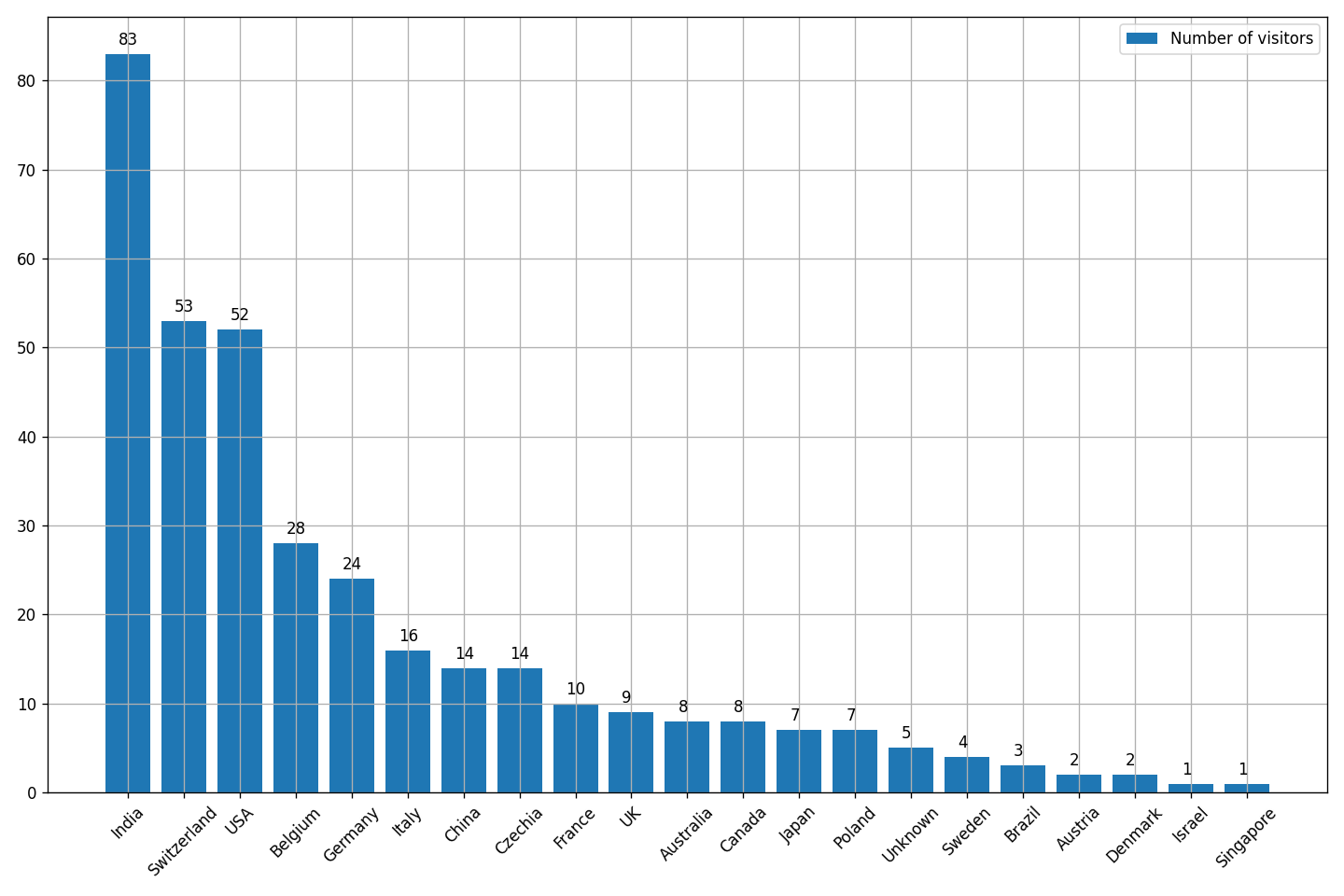
Users by countries
The script:
import numpy
import pandas

import matplotlib.pyplot as plt
plt.rcParams["figure.facecolor"] = "white"

tblNormalized = pandas.read_pickle("./users-table-normalized.pkl")

countriesCounts = tblNormalized.value_counts(subset=["country"])
# print([c[0] for c in countriesCounts.index.to_numpy()])
# print(countriesCounts.values)

fig, ax = plt.subplots(
    1,
    figsize=(12, 8),
    dpi=120,
    tight_layout=True
)

ax.bar(
    [c[0] for c in countriesCounts.index.to_numpy()],
    countriesCounts.values,
    #edgecolor="green",
    # linewidth=1.0,
    label="Number of visitors"
)

for i, v in enumerate(countriesCounts.values):
    ax.annotate(str(v), xy=(i,v), xytext=(-6,6), textcoords="offset points")

locs, labels = plt.xticks()
plt.setp(labels, rotation=45)

ax.grid(True)
ax.legend()

#plt.show()
plt.savefig("./countries-counts.png")
plt.close(fig)
Result:
Users heatmap by countries
The script (based on this):
import numpy
import pandas

import matplotlib.pyplot as plt
plt.rcParams["figure.facecolor"] = "white"

import plotly.express as px

tblNormalized = pandas.read_pickle("./users-table-normalized.pkl")

tblISOcountries = tblNormalized.copy()
tblISOcountries.country = (
    tblISOcountries.country
        .apply(lambda x: "Czech Republic" if (str(x) == "Czechia") else x) # "CZE"
        .apply(lambda x: "United States" if (str(x) == "USA") else x) # "CZE"
        .apply(lambda x: "United Kingdom" if (str(x) == "UK") else x) # "GBR"
        # and so on
)

gapminder = px.data.gapminder().query("year==2007")
# here you can view the full list of country names used by choropleth locations
#display(gapminder)
#gapminder["count"] = numpy.nan
#print(gapminder.query("country.str.contains('ingapo')"))

countriesData = tblISOcountries.value_counts(subset=["country"]).reset_index()
countriesData.columns=["country", "Visitors"]
#display(countriesData)

fig = px.choropleth(
    pandas.merge(gapminder, countriesData, how="left", on="country"),
    locations="iso_alpha",
    color="Visitors",
    hover_name="country",
    width=1920,
    height=720,
    color_continuous_scale=px.colors.sequential.Emrld
)

fig.update_layout(
    margin=dict(l=0,r=0,b=0,t=0),
    geo=dict(
        resolution=50,
        #showocean=True,
        #showland=True,
        #lonaxis=dict(showgrid=True),
        #projection=dict(scale=1)
        showcountries=False
    )
)
#fig.show()
fig.write_image("./countries-heatmap.png")
Here we are using Plotly library, and its documentation for choropleth states that iso_alpha value for locations means that it is three-letter ISO country codes. But in reality, as you can see in the code above, it’s fucking not three-letter codes but full country names, and not just any names but exactly those contained in px.data.gapminder().query("year==2007"). Just how is one supposed to discover that?
Anyway, here’s the result:
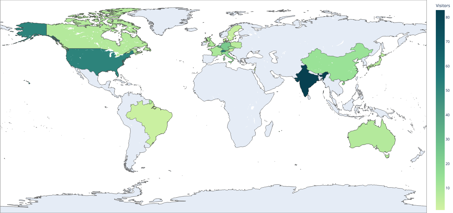
…But actually that is not the result that you’ll get - you’ll get something uglier because of the uncontrollable margins/paddings, which I’ve never managed to set right in code and so I’ve just edited the resulting picture to my liking.
So yeah, I did not enjoy working with Plotly.
Users count by companies
The script:
import numpy
import pandas

import matplotlib.pyplot as plt
plt.rcParams["figure.facecolor"] = "white"

tblNormalized = pandas.read_pickle("./users-table-normalized.pkl")

companiesCounts = tblNormalized.value_counts(subset=["companyName"])
# print([c[0] for c in companiesCounts.index.to_numpy()])
# print(companiesCounts.values)

fig, ax = plt.subplots(
    1,
    figsize=(12, 8),
    dpi=120,
    tight_layout=True
)

ax.bar(
    [c[0] for c in companiesCounts.index.to_numpy()],
    companiesCounts.values,
    label="Number of visitors"
)

for i, v in enumerate(companiesCounts.values):
    ax.annotate(str(v), xy=(i,v), xytext=(-6,6), textcoords="offset points")

#locs, labels = plt.xticks()
#plt.setp(labels, rotation=90)
plt.setp(
    ax.get_xticklabels(),
    rotation=45,
    ha="right",
    rotation_mode="anchor"
)

ax.grid(True)
ax.legend()

#plt.show()
plt.savefig("./companies-counts.png")
plt.close(fig)
Result:
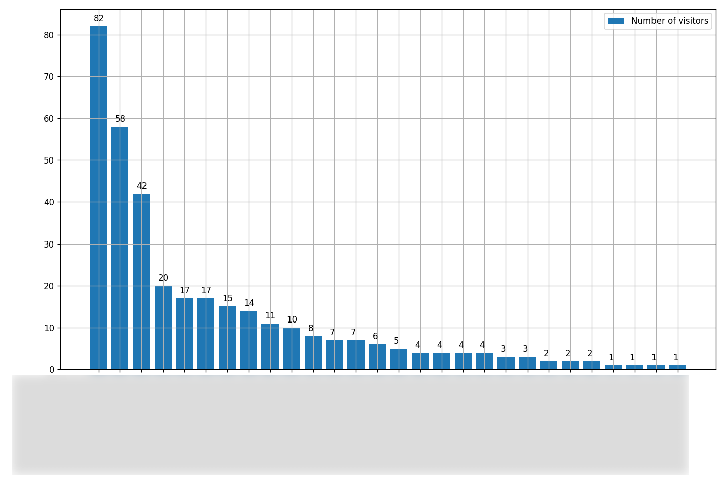
The companies names/teams/departments are blurred, so it’s not very useful to you, but still let it be.
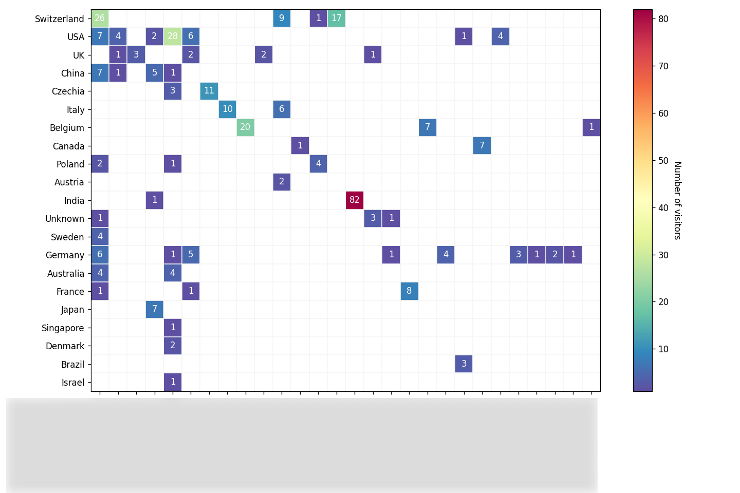
Joint countries and companies heatmap
Now that we have both countries and companies users numbers, we can visualize them as an annotated heatmap:
import numpy
import pandas

import matplotlib.pyplot as plt
plt.rcParams["figure.facecolor"] = "white"

tblNormalized = pandas.read_pickle("./users-table-normalized.pkl")

teamsAndCountries = tblNormalized[["companyName", "country"]]
# display(teamsByCountries)

teams = tblNormalized["companyName"].unique()
#print(teams)
countries = tblNormalized["country"].unique()
#print(countries)

#print(f"teams: {len(teams)}, countries: {len(countries)}")

teamsByCountries = numpy.zeros(
    shape=(len(countries), len(teams)),
    dtype=int
)

x = 0
for c in countries:
    y = 0
    for t in teams:
        teamsByCountries[x,y] = teamsAndCountries.query("country == @c and companyName == @t").shape[0]
        y += 1
    x += 1
#print(teamsByCountries)
#teamsByCountries[teamsByCountries == 0] = numpy.nan
teamsByCountries = numpy.ma.masked_where(teamsByCountries == 0, teamsByCountries)

fig, ax = plt.subplots(
    1,
    figsize=(12, 8),
    dpi=120,
    tight_layout=True
)

im = plt.imshow(
    teamsByCountries,
    #interpolation="nearest",
    cmap="Spectral_r"#"Dark2_r"#"tab20b"#"tab20c_r"
)

cbar = ax.figure.colorbar(im, ax=ax)
cbar.ax.set_ylabel("Number of visitors", rotation=-90, va="bottom")

ax.set_xticks(numpy.arange(len(teams)), labels=teams)
ax.set_yticks(numpy.arange(len(countries)), labels=countries)

plt.setp(
    ax.get_xticklabels(),
    rotation=45,
    ha="right",
    rotation_mode="anchor"
)

for i in range(len(countries)):
    for j in range(len(teams)):
        text = ax.text(
            j,
            i,
            teamsByCountries[i, j],
            ha="center",
            va="center",
            color="w"
        )

#ax.spines[:].set_visible(True)

ax.set_xticks(numpy.arange(teamsByCountries.shape[1]+1)-0.5, minor=True)
ax.set_yticks(numpy.arange(teamsByCountries.shape[0]+1)-0.5, minor=True)
ax.grid(which="minor", color="whitesmoke", linestyle="-", linewidth=1)
ax.tick_params(which="minor", bottom=False, left=False)

#plt.show()
plt.savefig("./teams-and-countries.png")
plt.close(fig)
Result (yet again with blurred companies/teams/departments names):
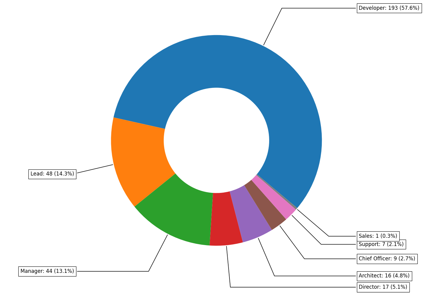
Users by job titles
The script:
import numpy
import pandas

import matplotlib.pyplot as plt
plt.rcParams["figure.facecolor"] = "white"

tblNormalized = pandas.read_pickle("./users-table-normalized.pkl")

jobTitlesCounts = tblNormalized.value_counts(subset=["jobTitle"])
# print([c[0] for c in jobTitlesCounts.index.to_numpy()])
# print(jobTitlesCounts.values)

fig, ax = plt.subplots(
    1,
    figsize=(12, 8),
    dpi=120,
    tight_layout=True
)

makePie = True

if not makePie:
    def prcnts(pct, allvals):
        absolute = int(numpy.round(pct / 100.0 * numpy.sum(allvals)))
        return "{:.1f}% ({:d})".format(pct, absolute)
    wedges, texts, autotexts = ax.pie(
        jobTitlesCounts.values,
        autopct=lambda pct: prcnts(pct, jobTitlesCounts.values),
        wedgeprops={"linewidth": 1, "edgecolor": "white"},
        frame=False
    )
    plt.setp(autotexts, size=9)
else:
    wedges, texts = ax.pie(
        jobTitlesCounts.values,
        wedgeprops=dict(width=0.5),
        startangle=-40,
        frame=False
    )
    bbox_props = dict(boxstyle="square,pad=0.4", fc="w", ec="k", lw=0.72)
    kw = dict(
        arrowprops=dict(arrowstyle="-"),
        bbox=bbox_props,
        zorder=0,
        va="center"
    )
    for i, p in enumerate(wedges):
        percentage = numpy.round(
            jobTitlesCounts.values[i] / numpy.sum(jobTitlesCounts.values) * 100.0,
            1
        )
        ang = (p.theta2 - p.theta1) / 2. + p.theta1
        y = numpy.sin(numpy.deg2rad(ang))
        x = numpy.cos(numpy.deg2rad(ang))
        horizontalalignment = {-1: "right", 1: "left"}[int(numpy.sign(x))]
        connectionstyle = "angle,angleA=0,angleB={}".format(ang)
        kw["arrowprops"].update({"connectionstyle": connectionstyle})
        ax.annotate(
            f"{jobTitlesCounts.index[i][0]}: {jobTitlesCounts.values[i]} ({percentage}%)",
            xy=(x, y),
            xytext=(1.35 * numpy.sign(x), 1.4 * y),
            horizontalalignment=horizontalalignment,
            **kw
        )

# ax.legend(
#     wedges,
#     [c[0] for c in jobTitlesCounts.index.to_numpy()],
#     title="Job titles",
#     loc="center left",
#     bbox_to_anchor=(1, 0, 0.5, 1)
# )

#ax.set_title("Visitors by their job titles")

#plt.show()
plt.savefig("./job-titles-counts.png")
plt.close(fig)
Result:
Visualizing the managers tree
Now, this one is not trivial. Firstly you need to create a tree/graph structure, and secondly you need to visualize it. There are several possible options for that:
- one way is to use DOT language and visualize resulting graph with Graphviz. I haven’t tried that;
- another way is to use Newick format and visualize resulting structure with ETE. I decided to go with this one.
It is worth to mention here that we are only interested in users and their managers that are present in the data frame that we’ve gathered, and so we won’t be fetching the full managers chain for every user (although we could).
Composing a Newick tree
Right away I would like to state that the code below is most definitely not the most optimal one, and most likely it’s rather bad, inefficient and perhaps even dumb. I’m really “challenged” when it comes to trees, graphs, algorithms and so on, so for me it’s already a great achievement that I’ve managed to come up with at least something that actually works.
And here it comes:
import numpy
import pandas
tblNormalized = pandas.read_pickle("./users-table-normalized.pkl")
managersCounts = tblNormalized.value_counts(subset=["managerMail"])
managers = [c[0] for c in managersCounts.index.to_numpy()]
#print(len(managers))
usersAndManagers = tblNormalized[["mail", "managerMail"]]
def getHigherManager(manager, depth):
global managersLevels
global managersTree
higherManager = None
managerOfManager = usersAndManagers.query("mail == @manager")["managerMail"]
if len(managerOfManager):
higherManager = managerOfManager.values[0]
# tree
if manager in managersTree:
# if not higherManager in managersTree[manager]:
# managersTree[manager] += [{higherManager: depth}]
pass
else:
managersTree[manager] = {higherManager: depth}
# levels
if depth in managersLevels:
if not higherManager in managersLevels[depth]:
managersLevels[depth] += [higherManager]
else:
managersLevels[depth] = [higherManager]
print(f"{'-' * depth} manager of {manager} is {higherManager}")
depth, higherManager = getHigherManager(higherManager, depth + 1)
#return higherManager
else:
higherManager = manager
return depth, higherManager
def getSlaves(manager, depth):
treeNode = []
dpth1 = depth
dpth2 = dpth1
slaves = usersAndManagers.query("managerMail == @manager")["mail"]
if len(slaves):
for slave in slaves:
if slave not in usersAndManagers["managerMail"].values:
continue
tn, dpth1 = getSlaves(slave, depth + 1)
if dpth1 > dpth2:
dpth2 = dpth1
treeNode.append({slave: tn})
#print(depth)
return treeNode, dpth2
managersLevels = {}
managersTree = {}
# for manager in managers:
# depth, higherManager = getHigherManager(manager, 1)
# # if depth == 3:
# # print(depth, higherManager)
#print(managersLevels)
#print(managersTree)
maxLevels = 1
for manager in managers:
slaves, depth = getSlaves(manager, 1)
if depth > maxLevels:
maxLevels = depth
managersTree[manager] = {"max-levels": depth - 1, "slaves": slaves}
#print(managersTree)
maxLevels -= 1
managersTreeReduced = dict(sorted(managersTree.copy().items(), key=lambda i: i[0].lower()))
#print(f"Maximum levels: {maxLevels}")
for level in range(maxLevels, 0, -1):
# if level < 4:
# continue
#print(level)
for node in managersTree:
if managersTree[node]["max-levels"] != level:
continue
for slave in managersTree[node]["slaves"]:
for email in slave.keys():
managersTreeReduced.pop(email, None)
#print(managersTreeReduced)
# for index, row in usersAndManagers.iterrows():
# slavesCount = usersAndManagers.query("managerMail == @row['mail']").shape[0]
# if slavesCount > 0:
# print(row["mail"], slavesCount)
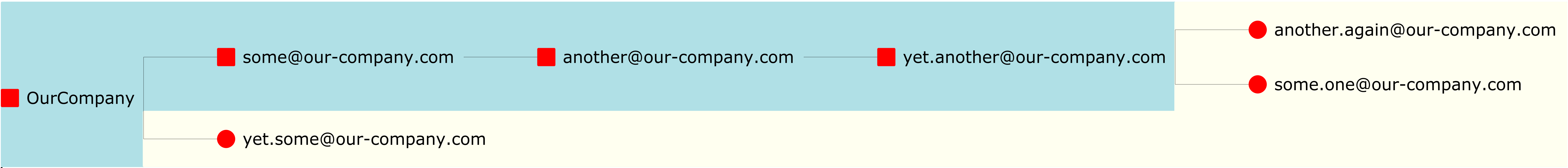
jsonTree = managersTreeReducedAs a result we will have a jsonTree string that looks like this:
{
    "some@our-company.com":
    {
        "max-levels": 3,
        "slaves":
        [
            {
                "another@our-company.com":
                [
                    {
                        "yet.another@our-company.com":
                        [
                            {
                                "another.again@our-company.com":
                                []
                            },
                            {
                                "some.one@our-company.com":
                                []
                            }
                        ]
                    }
                ]
            }
        ]
    },
    "yet.some@our-company.com":
    {
        "max-levels": 0,
        "slaves":
        []
    }
}
To turn such a JSON into a Newick string I’ve come up with the following functions:
def getLevelValues(jsonDict, depth, withLengths = False):
    newickString = ""
    for k in jsonDict:
        if len(jsonDict[k]) > 0:
            #print(f"{k}: {jsonDict[k]}\n---")
            leaf = []
            for v in jsonDict[k]:
                leaf.append(getLevelValues(v, depth + 1, withLengths))
                #newickString += f"({some})"
            #print(leaf)
            if withLengths:
                lngth = 1 - round(float(f"0.{depth+1}"), 2)
                newickString += f"({','.join(leaf)}){k}:{lngth}"
            else:
                newickString += f"({','.join(leaf)}){k}"
        else:
            if withLengths:
                lngth = 1 - round(float(f"0.{depth+1}"), 2)
                newickString += k + f":{lngth}"
            else:
                newickString += k
    return newickString


# this one gets one Newick string with one "artificial" top manager
# to join all disconnected highest managers
def json2newick1(jsonDict, withLengths = False):
    newickString = ""
    managersCnt = len(jsonDict.keys())
    for key in jsonDict.keys():
        newickItems = []
        #print(key)
        #print(key, jsonDict[key])
        for k in jsonDict[key]["slaves"]:
            #print(k.keys())
            newickItems.append(getLevelValues(k, 1, withLengths))
            # for kk in k.keys():
            #     print(f"{kk}: {k[kk]}")
        if newickItems:
            if withLengths:
                newickString += f"({','.join(newickItems)}){key}:0.9,"
            else:
                newickString += f"({','.join(newickItems)}){key},"
        else:
            if withLengths:
                newickString += f"{key}:0.9,"
            else:
                newickString += f"{key},"
    if newickString[-1] == ',':
       newickString = newickString[:-1]
    if managersCnt > 1:
        if withLengths:
            return f"({newickString})OurCompany:0.9;"
        else:
            return f"({newickString})OurCompany;"
    else:
        return f"{newickString};"


# this one gets a list of Newick strings
def json2newick2(jsonDict, withLengths = False):
    newicks = []
    #managersCnt = len(jsonDict.keys())
    for key in jsonDict.keys():
        newickString = ""
        newickItems = []
        #print(key)
        #print(key, jsonDict[key])
        for k in jsonDict[key]["slaves"]:
            #print(k.keys())
            newickItems.append(getLevelValues(k, 1, withLengths))
            # for kk in k.keys():
            #     print(f"{kk}: {k[kk]}")
        if newickItems:
            if withLengths:
                newickString += f"({','.join(newickItems)}){key}:0.9;"#,
            else:
                newickString += f"({','.join(newickItems)}){key};"#,
        else:
            if withLengths:
                newickString += f"{key}:0.9;"#,
            else:
                newickString += f"{key};"#,
        newicks.append(newickString)
    return newicks
    # if newickString[-1] == ',':
    #    newickString = newickString[:-1]
    # if managersCnt > 1:
    #     if withLengths:
    #         return f"({newickString})OurCompany:0.9;"
    #     else:
    #         return f"({newickString})OurCompany;"
    # else:
    #     return f"{newickString};"
Depending on the number of managers in your organization, you may choose between json2newick1() and json2newick2() functions. The first one joins all the managers chains under one common “artificial” manager, and the second one makes a list of chains, meaning that you’ll get not just one tree graph but several graphs (each in its own file).
In our case we don’t have that many managers, so we are using json2newick1() function. The resulting Newick string for our example will look like this:
((((another.again@our-company.com,some.one@our-company.com)yet.another@our-company.com)another@our-company.com)some@our-company.com,yet.some@our-company.com)OurCompany;or, for better readability:
(
    (
        (
            (
                another.again@our-company.com,
                some.one@our-company.com
            )
            yet.another@our-company.com
        )
        another@our-company.com
    )
    some@our-company.com,
    yet.some@our-company.com
)
OurCompany;
It is now ready to be visualized with ETE.
ETE graphs
First you need to install the package:
$ pip install ete3And even though it depends on PyQt5, weirdly enough it doesn’t install it on its own (package not configured properly?), so you’ll need to install it explicitly:
$ pip install PyQt5A simple tree graph
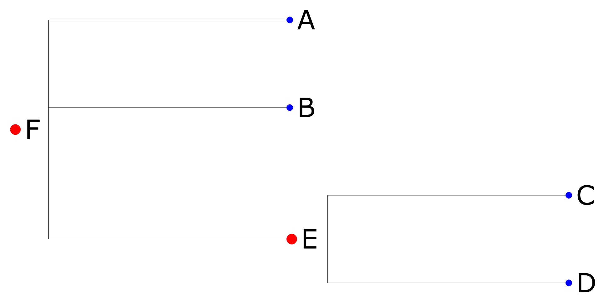
To get familiar with ETE, let’s first visualize a simple tree:
import ete3

#t = ete3.Tree("(A,B,(C,D)E)F;", format=8)
t = ete3.Tree("(A:0.1,B:0.2,(C:0.3,D:0.4)E:0.5)F;", format=1)

ts = ete3.TreeStyle()
ts.show_leaf_name = False

# http://etetoolkit.org/docs/latest/reference/reference_treeview.html#nodestyle

lstyle = ete3.NodeStyle()
lstyle["fgcolor"] = "blue"
lstyle["size"] = 1.5

nstyle = ete3.NodeStyle()
nstyle["fgcolor"] = "red"
nstyle["size"] = 3

for n in t.traverse():
    #print(n.name, n.is_leaf())
    nodeName = ete3.TextFace(n.name)
    nodeName.margin_left = 2
    nodeName.margin_right = 3
    n.add_face(nodeName, column=0)
    if n.is_leaf():
        n.set_style(lstyle)
    else:
        n.set_style(nstyle)

newickCircle = True
if newickCircle:
    ts.scale = 50
    ts.mode = "c"
    ts.arc_start = -85 # 0 degrees is 3:00 o'clock
    ts.arc_span = 175
    ts.branch_vertical_margin = 10
else:
    ts.branch_vertical_margin = 20

#t.render("./tree.pdf", tree_style=ts)
# DPI doesn't seem to affect anything, quality is managed by width/height,
# so to increase quality for bigger images you might want to set w=7680
t.render("./tree.png", w=1920, units="px", tree_style=ts) #dpi=300
#t.show()
Depending on newickCircle value you can get a circular graph:
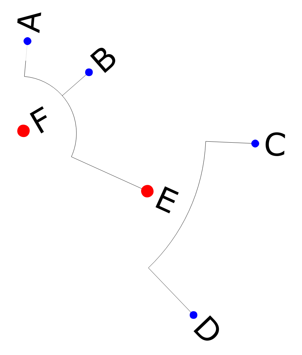
or a “straight” one:
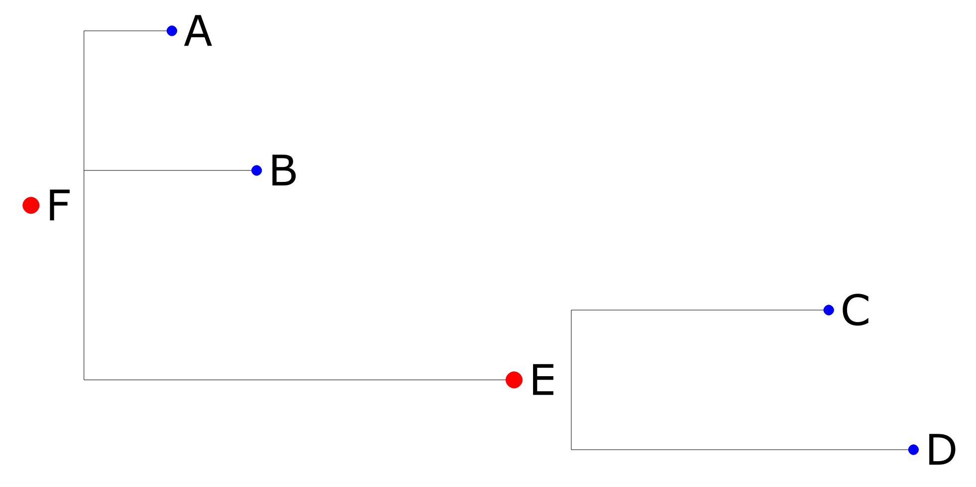
The circular variant certainly looks fancier, but if you have a lot of nodes in your tree, the result will be very difficult to read, so I’d recommend to go with the “straight” variant.
You might also have noticed that graph branches have different distances/lengths between nodes/leafs. That is a capability/feature of Newick/ETE, as there are several Newick formats that you can use. If you don’t need distances, use the format=8 instead, and then here’s the result you’ll get:
Rendering problems on different platforms
ETE renders fine to PDF (on all platforms?), but rendering to raster formats such as PNG has some problems. For instance, on Windows 10 with Python 3.10.5 the t.render() and t.show() commands fail for me like this:
t.render("./tree.png", w=1920, units="px")
#t.show()
TypeError: arguments did not match any overloaded call:
QImage(): too many arguments
QImage(QSize, QImage.Format): argument 1 has unexpected type 'int'
QImage(int, int, QImage.Format): argument 2 has unexpected type 'float'
QImage(bytes, int, int, QImage.Format): argument 1 has unexpected type 'int'
QImage(sip.voidptr, int, int, QImage.Format): argument 2 has unexpected type 'float'
QImage(bytes, int, int, int, QImage.Format): argument 1 has unexpected type 'int'
QImage(sip.voidptr, int, int, int, QImage.Format): argument 2 has unexpected type 'float'
QImage(List[str]): argument 1 has unexpected type 'int'
QImage(str, format: str = None): argument 1 has unexpected type 'int'
QImage(QImage): argument 1 has unexpected type 'int'
QImage(Any): too many argumentsIf I explicitly provide the height value too, then it fails differently:
t.render("./tree.png", w=1920, h=1080, units="px")
#t.show()
752 ii= QImage(w, h, QImage.Format_ARGB32)
753 ii.fill(QColor(Qt.white).rgb())
--> 754 ii.setDotsPerMeterX(dpi / 0.0254) # Convert inches to meters
755 ii.setDotsPerMeterY(dpi / 0.0254)
756 pp = QPainter(ii)
TypeError: setDotsPerMeterX(self, int): argument 1 has unexpected type 'float'And that seems to be a bug in PyQt. It might help to install an older version of Python (and probably PyQt), but I haven’t checked that myself.
On Mac OS all the same works fine with Python 3.9.13.
Managers tree graph
Finally, here’s how our Newick string with managers can be visualized as an ETE graph:
newickWithLehgths = False

newickString = json2newick1(jsonTree, newickWithLehgths)
print(newickString)

#newicks = json2newick2(jsonTree, newickWithLehgths)
#print(newicks)

newickFormat = 1 if newickWithLehgths else 8
newickCircle = False

ts = ete3.TreeStyle()
ts.show_leaf_name = False
#ts.show_branch_support = True
if newickCircle:
    ts.scale = 50
    ts.mode = "c"
    ts.arc_start = -85 # 0 degrees is 3:00 o'clock
    ts.arc_span = 175
    ts.branch_vertical_margin = 10
else:
    ts.branch_vertical_margin = 20

# ---

styleLeafManagerVisited_size = 10
styleLeafManagerVisited_bgcolor = "Ivory"#"#FDFDFD"

styleLeafManagerVisited = ete3.NodeStyle()
styleLeafManagerVisited["fgcolor"] = "blue"
styleLeafManagerVisited["size"] = styleLeafManagerVisited_size
styleLeafManagerVisited["bgcolor"] = styleLeafManagerVisited_bgcolor

styleLeafManagerNotVisited = ete3.NodeStyle()
styleLeafManagerNotVisited["fgcolor"] = "red"
styleLeafManagerNotVisited["size"] = styleLeafManagerVisited_size
styleLeafManagerNotVisited["bgcolor"] = styleLeafManagerVisited_bgcolor

# ---

styleLeafManagerNotVisited_size = 10
styleLeafManagerNotVisited_shape = "square"
styleLeafManagerNotVisited_bgcolor = "PowderBlue"#"#FAFAFA"

styleNodeManagerVisited = ete3.NodeStyle()
styleNodeManagerVisited["fgcolor"] = "blue"
styleNodeManagerVisited["shape"] = styleLeafManagerNotVisited_shape
styleNodeManagerVisited["size"] = styleLeafManagerNotVisited_size
styleNodeManagerVisited["bgcolor"] = styleLeafManagerNotVisited_bgcolor

styleNodeManagerNotVisited = ete3.NodeStyle()
styleNodeManagerNotVisited["fgcolor"] = "red"
styleNodeManagerNotVisited["shape"] = styleLeafManagerNotVisited_shape
styleNodeManagerNotVisited["size"] = styleLeafManagerNotVisited_size
styleNodeManagerNotVisited["bgcolor"] = styleLeafManagerNotVisited_bgcolor

# ---

t = ete3.Tree(newickString, format=newickFormat)

for n in t.traverse():
    #n.dist = 0
    nodeName = ete3.TextFace(n.name)
    nodeName.margin_left = 5
    nodeName.margin_right = 5
    n.add_face(nodeName, column=0)
    #print(n.name, n.is_leaf())
    #print(n.name, n.name in usersAndManagers["mail"].values)
    if n.is_leaf():
        if n.name in usersAndManagers["mail"].values:
            n.set_style(styleLeafManagerVisited)
        else:
            n.set_style(styleLeafManagerNotVisited)
    else:
        if n.name in usersAndManagers["mail"].values:
            n.set_style(styleNodeManagerVisited)
        else:
            n.set_style(styleNodeManagerNotVisited)


#print(t.write(format=8))

#print(f"root_opening_factor: {ts.root_opening_factor}")
#ts.root_opening_factor = 1

folderWithRenders = pathlib.Path("./trees")
if not folderWithRenders.exists():
    folderWithRenders.mkdir()
t.render((folderWithRenders / f"{t.name}.pdf").as_posix(), tree_style=ts)
t.render(
    (folderWithRenders / f"{t.name}.png").as_posix(),
    w=(1080 if newickCircle else 640),
    units="px",
    tree_style=ts
)

# that is for visualizing json2newick2() results
commentedOut = """
for ni in newicks:
    #print(ni)
    #t = ete3.Tree("(A:0.1,B:0.2,(C:0.3,D:0.4)E:0.5)F;", format=1)
    #t = ete3.Tree("(A,B,(C,D)E)F;", format=8)
    t = ete3.Tree(ni, format=newickFormat)

    for n in t.traverse():
        #n.dist = 0
        nodeName = ete3.TextFace(n.name)
        nodeName.margin_left = 5
        nodeName.margin_right = 5
        n.add_face(nodeName, column=0)
        #print(n.name, n.is_leaf())
        if n.is_leaf():
            n.set_style(styleLeafManager)
        else:
            n.set_style(styleNodeManager)

    #print(t.write(format=8))

    #print(f"root_opening_factor: {ts.root_opening_factor}")
    #ts.root_opening_factor = 1

    folderWithRenders = pathlib.Path("./trees")
    if not folderWithRenders.exists():
        folderWithRenders.mkdir()
    t.render((folderWithRenders / f"{t.name}.pdf").as_posix(), tree_style=ts)
    t.render(
        (folderWithRenders / f"{t.name}.png").as_posix(),
        w=(1080 if newickCircle else 640),
        units="px",
        tree_style=ts
    )
"""
The resulting graph for our example managers tree from above will look like this:
The graph legend:
- icon shape:
- circle means lowest level manager with only non-manager subordinates;
- square (and teal-ish background) means manager who has other managers as his subordinates;
- icon color:
- blue means that this user has visited at least one of our resources himself;
- red means that this user has not visited any of our resources (so it’s only his subordinates who have) and he is present on the graph only as a part of the managers tree.
It’s only managers (users with at least one subordinate) who are present on this chart, because visualizing the entire tree with all the subordinates would (dramatically) overload the resulting graph.
If your graph is big enough, then to have it readable in a raster output you’ll need to (considerably) increase the width/height parameters of the render() method, but that will also result in a very big file (several megabytes). So what I did instead is I render it twice: to a proper readable PDF and also to a small low-resolution PNG. The PNG is then used as a preview with a link to the PDF variant underneath.
By the way, here’s an example of a circular graph variant, just to demonstrate that it is harder to read when it has a lot of nodes:
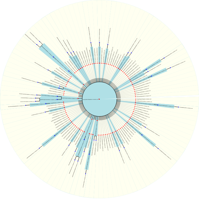
“Limiting” the circle with arc_start/arc_span properties makes it more readable, but still not good enough. Which is why I recommended to go with a non-circular variant.
Conclusion
Almost all the charts turned out to be quite useful, and in general it’s nice to have data not as dull tables but as fancy-ish visualizations.
The managers graph ended up being kind of useless, in my opinion. It is certainly cool to be able to visualize tree structures like this, which is why I did it in the first place, but I can’t think of a way how this particular managers graph could be useful for the purpose of the visitors analytics. Moreover, if one is interested to see the managers tree of some employee, he can just as well look it up in that user’s Outlook/Teams profile card.
If you have other ideas (and examples) of what kind of charts one could make for the purpose of visitors analytics, it would be great if you shared those in comments. And if you can suggest a better code for generating a tree structure for composing a Newick string, that would be awesome too.